Welcome to A Stampers Paradise!

You've stumbled upon my escape from the daily grind! I hope you enjoy what you see here. I am a SU Demo who loves trying new techniques, holding card making classes, creating techniques of my own, and most recently blog design, I love anything stamping related! I hope you'll stay a minute and come again! I'd love to know you were here, so feel free to leave comments!

Saturday, August 28, 2010

Some of this, a little of that...Original.

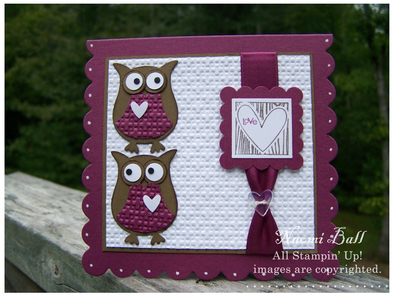
Hey, friends! I have had so many fall cards to make over the past few weeks for swaps. I couldn't be happier, because that must mean Fall is on the way! I am done with heat, I am ready for rich colors dripping from trees, the hum of happiness in the air, and homemade stews simmering on the stove. I didn't do a traditional 'Fall' card with an autumn saying, or for a Fall holiday. I went with my feelings about fall, the colors, the comfort. What I ended up with is vintage in style, fall in color, and original in application. I, quite by accident, discovered a new technique that I love:)

We all know how to clear emboss an image, then sponge/brayer over it, then place the image face down on a few paper towels and use an iron on high heat to remove the embossing. Right? It's nothing new. But, it covers the embossed area, allows you to fill around it, then allows the embossing to be removed, leaving smooth paper. It's cool, I have been doing it forever. But, usually after I sponge all around the image, I will lightly mist a paper towel with Stampin Mist and buff the ink off of the embossed areas. No reason, I just always do. Well, tonight I did not. I left the ink on, and went straight to ironing the embossing off. What is left is really neat. Some of the ink pulled back onto the image after ironing. It's great! I won't always do it, but it's a different look. For those who can't tell what I am yakking about (don't worry, happens all the time), click on the first picture and look at the white areas. They should be solid white. This time, they're not. I will be making this mistake more often! I love the look.

Since I went off on a talking spell there (again, happens all the time), I will end this post here. I just want to point out the detail pic below and how much taking time to properly 'age' papers really makes the vintage feel work. K...that's all, like I promised! Supplies listed below...

Finished size: 5"x5"

Supplies: All from SU!
Stamps: Medallion, Define Your Life
Paper: Early Expresso, Cherry Cobbler, Whisper White
Ink: Early Expresso, Cherry Cobbler, Pumpkin Pie, Daffodil Delight, VersaMark
Punches: Wide Oval, Modern Label, Word Window
Accessories: Chantilly Crochet Trim, Square Rhinestone Brad (Fire), Clear EP, Sponges, Dimensionals, Stick Strip --- Household Iron

Tuesday, August 24, 2010

Life is like a bowl of cherries!

This post is a before and after kind of deal. I made this card for an Alphabet Swap for an online swap group. Obviously, we are on the letter 'C'. After struggling with many ideas: coffee, cats, cute, etc, I finally decided on 'Cherries'. Here is the finished card. I made this card last night, it was ready to mail. Then this morning it was bothering me...something just wasn't right, so I 'finished' it this morning. I don't always include the letter on my card, but this card seemed to need something in the bottom. Let me know if you think it's better after I finished it or before. This card uses SU new color, Cherry Cobbler paired with Old Olive. The cherry stamp is from Tart & Tangy, stamped with VersaMark and embossed with Clear Embossing Powder. It made a cute background without having DSP in these colors. The bowl, cherries, stems, and white plate they are sitting on are all made from SU punches. The cherries were punched out of Cherry Cobbler CS that I embossed a big square for shininess before punching. I used the Dotted Scallop Ribbon Border punch that I just got, too! And below is the 'before' picture that I decided was too plain.

Supply List:
Cardstock: Whisper White, Cherry Cobbler, Old Olive
Ink: VersaMark pad, Old Olive Marker, Signo White Gel Pen
Stamps: Tart & Tangy
Punches: 1/2" Circle, 1 3/8" Circle, 1 3/4" Circle, Small Oval, Scallop Circle, 2-Step Bird, Dotted Scallop Ribbon
Dies: Big Shot with Scallops #2, Perfect Dots Embossing Folder, and Wingo Zingo Alphabet Die (by Sizzix)
Accessories: Clear Embossing Powder, Mat Pack, Dimensionals, and Glue Dots

Wednesday, August 18, 2010

Hoo Loves You???

Hey, everyone!!! I made this card for a Fall swap, I actually made two of these for two separate Fall swaps. I usually do reds, browns, and oranges for Fall. But, Soft Suede and Rich Razzleberry felt Fall-ish to me this time! I think most of us think of owls at Fall, and I definitely wanted to use my brand new 2 Step Owl Punch! Isn't it AWESOME??? I am a punch addict, and this one is a new fave!

So many elements go into making a card work. Colors, textures, layers, focal points, embellishments, and many more. This card makes full use of many of those, whereas I generally keep things a little simpler.

I started with the Rich Razzleberry base as a rectangle A2 card. I decided it needed some UMPH, so I ran it through the Big Shot with SU's Scalloped Square Bigz Clear die! Perfect. I used a Signo Gel Pen (also sold by SU), to make dots on each scallop so the base didn't seem plain and forgotten. The layers are Whisper White and Soft Suede. The Whisper White layer is also run though the Big Shot with the Square Lattice Embossing folder. The Razzleberry part of the owls is also embossed with the same folder. Pulling those textures together makes so much difference. The owl punch includes the tiny heart I put on their chests. The edges of the owls are sponged, and the base of the eyes is run across the ink pad.

I then simply ran ribbon and taped it to the front and back of the layer (saves so much ribbon as opposed to bulky bows that don't mail well anyway!), and used a heart Bitty Button tied with crochet thread around it. The stamp is from Cute by the Inch, a new Level 2 Hostess Set. It's on a 1" white square, layered on Rich Razzleberry punched with SU's Scallop Square and popped up over the ribbon on Dimensionals. For the image, I used SU markers to color the word LOVE with Rich Razzleberry and the rest with Soft Suede.

I know it seems I went into way more detail for this post than I usually do, and you're right, I did. Lately, I have had a lot of messages asking how I put something together, or how I obtained a specific effect, or to share my tips for layering and tying things together. For cards with more detail, I will make an effort to go into more detail for those who want to know. If you have more questions, please feel free to contact me through my profile, or leave a comment here!

Thanks so much for stopping by, I hope you like my take on a Fall card!

*Owl see you next time!*

Friday, August 13, 2010

You're A Blast!!!

(Click on picture to enlarge for detail.) Ahhh...I had SO much fun making this one. It's my first Tent Card, and I learned a lot! I made many mistakes, but next time I make one, I will know! I couldn't get a good side shot, and I tried a zillion times:) The is a standard A2 card, however instead of being open at the bottom, it's actually attached to the back with a step/valley accordian piece to give the card a sturdy base, and depth. Messages would be attached to the back. This card could have been so much more, but I realized a lot of things too late. I will be making more!
*
The inside of the card is the 'sky' background for the rockets trip! It's SPONGED (can you believe it? LOL!), then the sun/moon is heavily sponged, and twisted to get the haze around it. I used Itty Bitty Backgrounds for the stars. I ran some scrap paper through the Big Shot with Stars #2 die, and detached the sentiment from the rocket image. The rocket is not tied or jump ringed like the other tent cards I have seen. I wanted the actual illusion of flying, so it's attached with acetate.
*
I also used some Styled Silver HPH, retired Silver Cording. There's Crystal Effects on the lights and window of the rocket, which didn't show in the pic. All the stars also have a touch of CE on the tips.
*
Colors: Pacific Point, Daffodil Delight, Real Red, Pumpkin Pie
Stamps: Pun Fun, Itty Bitty Backgrounds
Dies/Punches: Stars #2, Perfect Polka Dots embossing folder, Word Window Punch
Accessories: Sponges, HPH, Cording, Crystal Effects
*
As usual...SUO. I can't wait to try another one and post for you to see that I can do this better...I think:)

Thursday, August 12, 2010

A little more sponging, and more to believe in...

So, the sponging kick continues! This is another card I made for my Aug club meeting. The sponging is done using a piece of paper as a mask, and a 1 3/8" circle punched out of it. We kept it light by using Sahara Sand CS, and Sahara Sand ink for the sponging. The only other color is Rich Razzleberry for the ink, and the yummy Satin ribbon! I love the simplicity of the design, and one layer cards are a challenge for me, so I love trying to make them. I think this would make a really nice sympathy card, or even encouragement through a hard time.

Stamp set is Just Believe
Ink is Sahara Sand - Rich Razzleberry
Sponging, masking

Blogger notes: To the "Inky Ones", I caught up last night making my rounds to visit all of you.

Happy Stampin'!

Monday, August 9, 2010

Something to Believe in...

I am on a Fall kick lately! If you can't tell, I am way past done with summer! I cling to the belief that Fall can't be too far off:) This card features a beautiful new set from SU, Just Believe. I used this card for my August club meeting, and used it for a Fall swap as well. The new color, Cajun Craze, is really growing on me! Kind of Really Rust meets Dusty Durango, it's the perfect fall color. It's simply paired here with a Basic Black base and layer, and sponging with More Mustard, Pumpkin Pie and Cajun Craze. I used these rusty colors to create a fall sunset. The flower is stamped with Jet Black StazOn. I love the deepness of this black! I also ran the Cajun Craze layer through the Big Shot with the Square Lattice Embossing Folder.

This is such a simple card, and could easily be changed up using different colors. I want to try it with an Early Expresso base, Marina Mist background and sponging with Bashful Blue, Marina Mist and maybe Not Quite Navy. I am stuck on sponging lately, which makes it easy not to spend money on manicures:)

Hope you all like it!

Happy Stampin'!

Tuesday, August 3, 2010

Scenic Halloween...

First of all, NO, I am not ahead on making cards for any holiday:) This card was made for a month long Fall themed swap among a group of SU Demos. Each Monday of the entire month, I will make and send a Fall themed card to my partner. Here's my first one. I really grew to like this one, and had a time hard putting it in an envelope.

The little girl image is new from SU, the set is called Greeting Card Kids, and all the images are just as cute! I can see me getting a lot of use out of this one! I started by stamping the image on Watercolor Paper with Jet Black Stazon (my first choice for watercoloring). I then stamped it on copy paper, and cut it out closely to make a mask. Once the mask was in place, I used the tree line stamp from Lovely As A Tree, and stamped that in Early Expresso. I punched a 1 3/8" circle out of copy paper, and masked the moon. Then I sponged the sky and ground, then removed the circle and used the negative to sponge the moon. There are two Early Expresso ribbon loops under the layers, and the sentiment is from Teeny Tiny Wishes.

Creating scenes with masking and multiple stamps is one of my favorite things to do. This wasn't a quick card, the coloring alone took me quite a while (and I still ended up with a little bleeding on one of her arms), but I love the end result. I was a little behind on stamping, and it was great just to sit and create this!

Stamps:
Lovely As A Tree
Greeting Card Kids
Teeny Tiny Wishes

Inks:
Rich Razzleberry
Not Quite Navy
Daffodil Delight
Old Olive
Pumpking Pie
Blush Blossom

Paper:
Rich Razzleberry & Early Expresso CS
WaterColor Paper

Accessories:
Word Window Punch
Modern Label Punch
1 3/8" Circle Punch
AquaPainters
Early Expresso 5/8" Grosgrain Ribbon

Hope you like it!!! I will have to make another for keepsies:) As usual, SUO!